category: brand identity
deliverables: business stationary, website
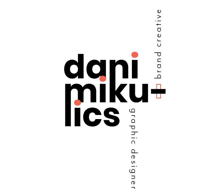
concept: I wanted to create a professional brand identity that was bold and daring, while also communicating happiness and joy in a professional manner.
My bold side is communicated through the heavy typeface, Poppins Bold spelling out my first and last name. My last name, ‘Mikulics’, has belonged to primarily men in my family’s ancestral history; I am proud of the courage and strength in the name that I also see within myself as a female designer in today’s world. It was important to me that my last name was incorporated into my signature, the best way to do this was by creating a tightly leaded stacking effect with the type that fit together perfectly (after some kerning) that developed a bold and structural mark. I am not more important than the weight of my last name, I see them both as different parts of me that equally make up who I am.
To break up the heaviness of the bold mark and also communicate my bubbly side, I used the warm red Pantone 172 U to color the tittle of the ‘i’ letters so they would stand out (just like me!). The same color is also used as a rectangular outline behind the hyphen in my signature subtly creating a plus sign symbol to signify my versatility as a designer. This sign is also spaced intentionally in-between 'graphic designer’ and ‘brand creative’ to act as the ‘and’ sign to bring together both titles. This red Pantone shade is the secondary color for the entirety of my personal brand and carefully placed on throughout my brand identity.
business card:


letterhead & #10 envelope:


notecard (front & back):

